Cath Carter | Brand Identity
Catherine approached me to help her redesign her ‘Cath Cater’ brand as her following and beauty product range offering had grown very quickly, and she needed a professional look that reflected the quality of her products and also matched her personality.
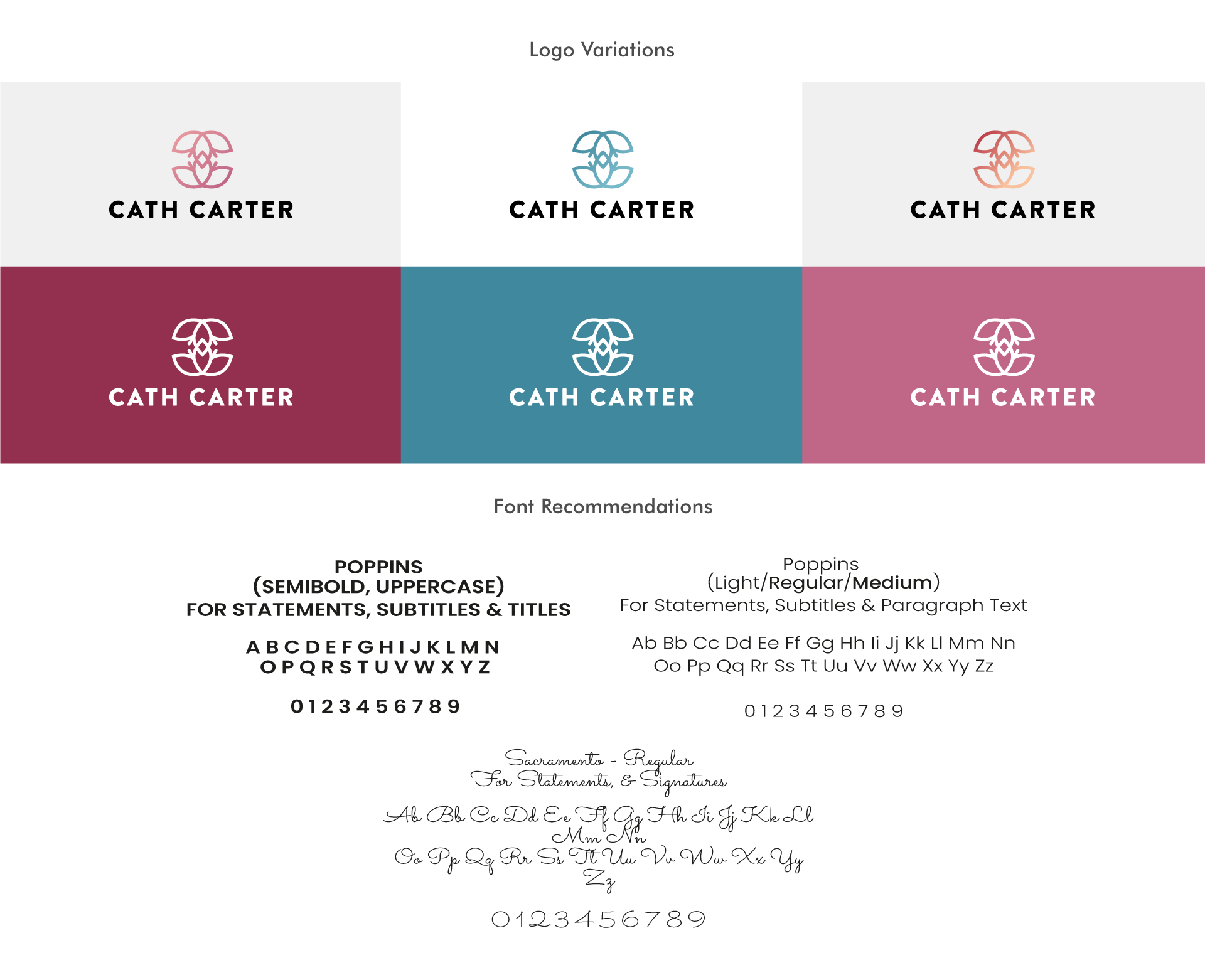
The Clematis flower has a significant meaning to her and so I wanted to try and bring this into the logo design and into elements of the brands patterns/textures. I created a simplified side on view of the Clematis flower which I then duplicated and flipped upside down, placing it slightly over the top of the tip of the first flower to create a ‘C’ and backwards ‘C’ shape to represent ‘Cath Carter’. Below are some alternative variations of the logo that can be used on pale and coloured backgrounds.


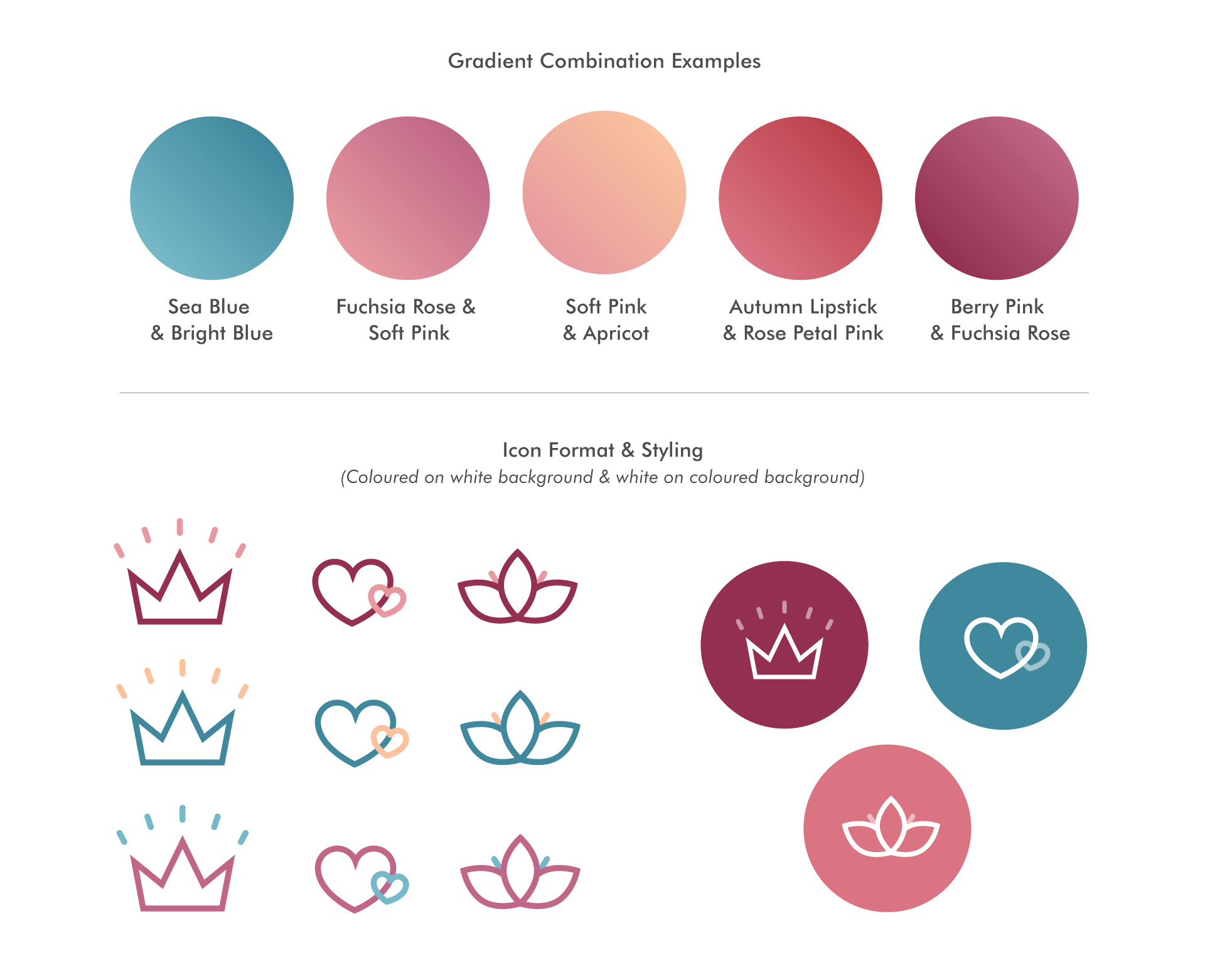
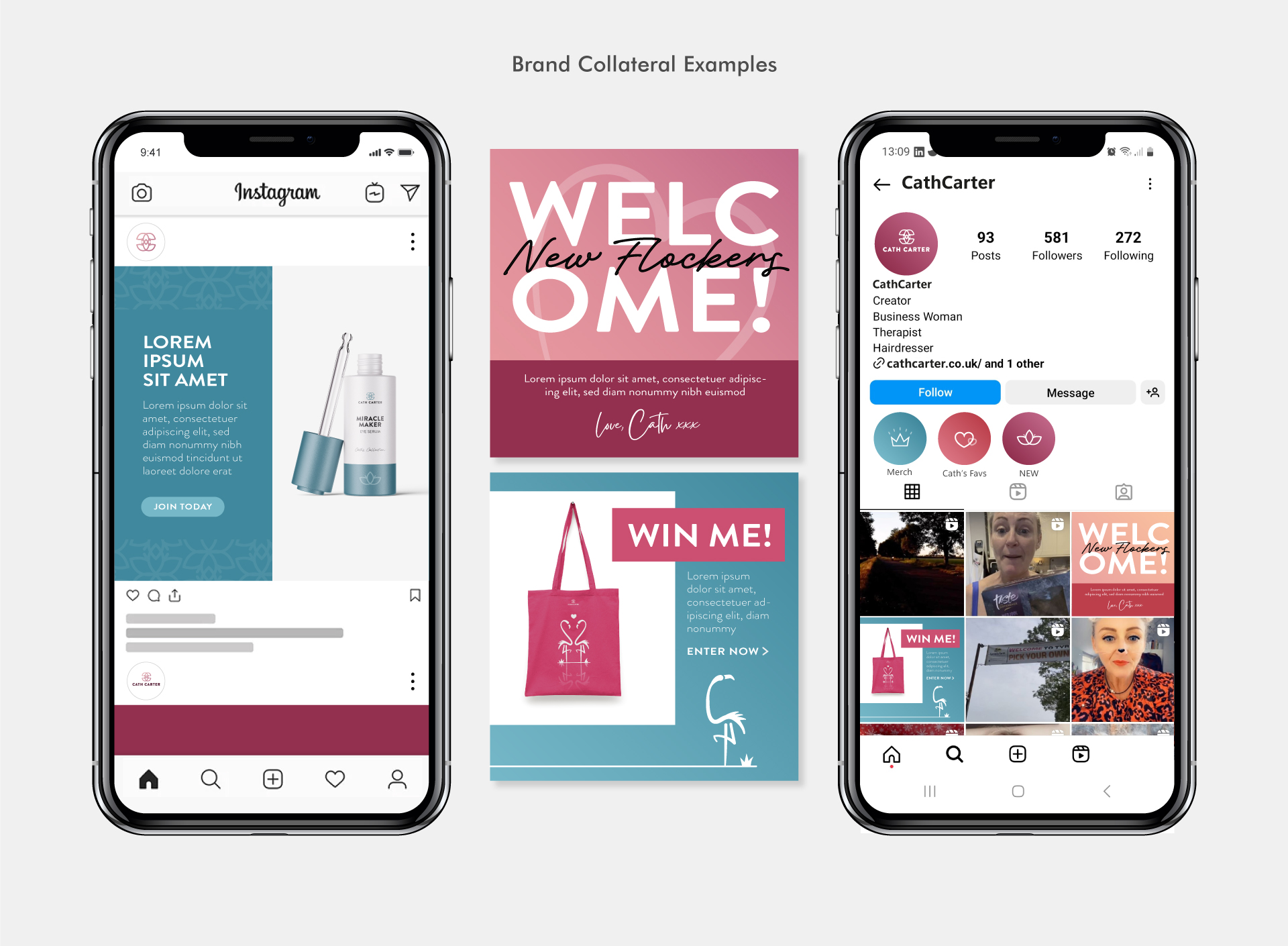
Below are some pattern designs created for the brand. I used the Clematis flower to create some simple structured flower designs, as well as love heart patterns to be used throughout various brand collateral such a gift boxes, social media post design, product packaging etc.


Cath required two logos for sub brands that sat within the Cath Carter brand; NBS and Flocking Fabulous. The logos needed to have their own look but be similarly styled to link to the CC brand.

Need a brand identity creating for your business?
If you’re a new business looking to have your brand identity created, or you’re an established business needing a brand refresh – please feel free to drop me an email, I’d love to find out more about your project and help bring your branding to life!


